By default the menu that is created is automatically associated or "linked"
to the currently selected dialog in the main PowerBASIC Forms editor window.
In addition, PowerBASIC Forms automatically creates a new ID Name (equate)
for the identification of the menu and displays it in the Menu Editor's
caption text. The assigned name can be edited in the ID
Editor window.
Before we discuss the steps involved in creating a menu, we'll first
need to discuss some of the terminology before we resume our discussion
on the items in the Menu Editor window.
Firstly, we must explain the difference between a menu member and a
Menu Item. The former is a generic term used to describe any component
of a menu, whereas a Menu Item is a specific type of menu component (a
selectable menu item). Pop-up menu members are designed to "pop up"
additional menu members in the form of a drop-down menu. The drop-down
menu can contain Menu Items, Separators, and additional Pop-up menu members.
Depending on the type of menu member being edited or created, PowerBASIC
Forms will automatically enable or disable controls on the Menu Editor
window to make it simple to choose the appropriate settings for each menu
member.
|
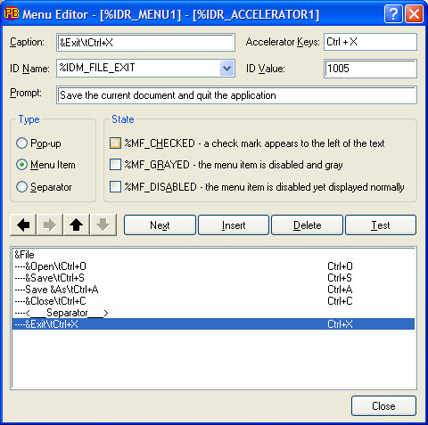
Caption |
The title of the menu member is entered into the Caption field, for
example "File". In the above example, the ampersand character
specifies the following character is drawn underscored, indicating the
keyboard accelerator key to select the menu item, in this case the F character.
In Pop-up menu items, this hot-key is accessed with the ALT+key combination,
whereas for menu items, this is the plain key stroke required to select
the menu item. |
|
Accelerator Keys |
Accelerator Keys provides a very simple method of specifying the keyboard
accelerator that will activate the menu item, without the menu even being
displayed. Typically, these are CTRL+key combinations, and when the Accelerator
Keys control has focus, the actual key combination can be entered directly.
Accelerator Keys are only available for Menu Items. When the first accelerator
for a Menu Item is created in the Accelerator Keys control, PowerBASIC
Forms automatically creates a new name (equate) for the accelerator table,
and this is shown in the Menu Editor's caption text.
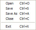
When the Menu Item is displayed, the accelerator key is automatically
shown to the right of the Menu Item text. For example:
|
|
ID Name |
The ID Name is an automatically generated (yet editable) equate name
that is used in the generated code to identify the specific menu item.
If edited, the equate must follow normal equate (and variable) naming
conventions. It is recommended to use descriptive equate names, since
this makes the final source code more readable than %X1, %X2, etc. Existing
ID Names can be reused simply by selecting the name from the drop-down
list portion of the ID Name box.
Note that this facility is primarily designed for sharing of ID Names
between menu items and controls on the associated dialog. Using one ID
Name for two or more menu items in the menu is not recommended. |
|
ID Value |
Like the ID Name field, PowerBASIC Forms automatically assigns a numeric
value to identify the menu member, although this value can be edited.
The ID Value should be in the range 1 to 65535. The default value is automatically
assigned by PowerBASIC Forms. |
|
Prompt |
When a prompt string is entered, the string forms a part of a string
table that is stored in the project's resource file (.RC file), generated
in tandem to the PowerBASIC source code.
Prompt strings are often used to create customized tooltips or to offer
descriptive messages and/or information about a menu item, typically by
displaying the prompt string in a status bar control.
For dialogs that contain both a status bar
control and a menu, PowerBASIC Forms v1.50 (or later) will automatically
generate the code for a %WM_MENUSELECT callback handler which will display
prompt strings of highlighted menu items in the status bar control. |
|
Type |
The Type section is used to determine the precise type of menu member
being edited or created:
|
Type |
Description |
|
Pop-up |
A top level menu member (visible in the menu bar when no menus are open).
In the above screen shot, this is the "File" portion. The Pop-up
menu member is the "parent" of a drop-down menu list. Pop-up
menu members can also be part of a drop-down menu, opening yet another
drop-down menu. This situation is commonly known as "nested menus". |
|
Menu Item |
A member of a Pop-up menu's drop-down menu list. In the above example,
these are items such as "Open", "Save", etc. Menu
Items can also be top-level menu items that do not produce a drop-down
menu when clicked or selected. In this case, a Menu Item immediately sends
a click notification to the dialog callback. |
|
Separator |
A horizontal line used to visually separate groups of unrelated menu
items in a Pop-up menu. |
|
|
CHECKED |
The menu item receives a check mark (tick or bullet) to the left of
its text, usually to indicate some form of "active" mode, similar
to the operations of an OPTION button. The Checked style is only valid
for Menu Items, but has no effect if the Menu Item is a top-level menu
member. |
|
GRAYED |
The menu member is grayed and disabled, and is therefore not selectable
by the user. Both Pop-up and Menu Items can be grayed. |
|
INACTIVE |
The menu member is disabled but is displayed quite normally. Both Pop-up
and Menu Items can be inactive. |
|
Indent/Unindent |
(Shown as Left and Right facing arrows on buttons). These buttons indent
or unindent Menu Items and Separators. For example, a Menu Item that is
indented (right) one level below a Pop-up, will appear as part of the
drop-down menu of that Pop-up. If the Menu Item is unindented completely
(moved to the left-most position), it will become a top-level menu member.
By convention, Menu Items that appear in the top level should always have
a trailing exclamation character (!) to signify the "immediate"
nature of the Menu Item. For example, "Quit!". |
|
Move Up/Down |
The move up and down buttons (shown as Up and Down facing arrows on
buttons) are used to rearrange the relative position of menu members in
a menu structure. With these buttons, a Menu Item in one portion of a
drop-down menu can be moved to appear as a Menu Item in another drop-down,
simply by moving the Menu Item into a position under the other Pop-up
menu member. |
|
Next |
This advances the selection of the current menu member to the next menu
member in the structure diagram at the bottom of the Menu Editor window.
If the last menu member is selected when the Next button is pressed, a
new Menu Item member item is created beneath. |
|
Insert |
A new menu member is created (inserted) at the current position in the
structure diagram, and the existing members move down one position. The
new menu member is automatically created as the same Type as the menu
member that previously occupied that position. |
|
Delete |
The menu member at the current position is deleted. However, a deletion
confirmation dialog is first displayed before the menu member is destroyed.
When a member is deleted, the remaining members move up one position in
the structure diagram. |
|
Test |
Displays the menu test dialog. This dialog enables the menu structure
to be tested as it will appear when used in a fully-fledged application.
If a Menu Item is selected, the Menu Test engine displays a modal message
box to signal a successful selection. The Menu Test dialog is resizable,
and PowerBASIC Forms will maintain the position and size of the Menu Test
dialog between editing sessions. |
|
Structure Diagram |
A visual representation of the menu structure is shown in the large
control at the bottom of the Menu Editor dialog. Menu Items are shown
indented one level to the right of a Pop-up menu member. |
|
Close |
Dismisses the Menu Editor and returns back to design mode. |
 ,
the Tools drop-down menu, or with the CTRL+SHIFT+M hot-key combination)
provides a straightforward method to rapidly create menus, complete with
Accelerators Keys and an optional Prompt string (which can be displayed
in a status bar control as the mouse hovers over a menu item.
,
the Tools drop-down menu, or with the CTRL+SHIFT+M hot-key combination)
provides a straightforward method to rapidly create menus, complete with
Accelerators Keys and an optional Prompt string (which can be displayed
in a status bar control as the mouse hovers over a menu item.