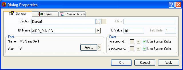
A typical General tab of a Properties dialog looks something like this:
|
Caption |
The Caption field is a text title assigned to the control or dialog. For example, in the case of a BUTTON control, the caption text is the text displayed on the button. The caption text field is also used to specify a hot-key by prefixing the designated hot-key letter with an ampersand (&) symbol. For example, the caption "Please &Quit" assigns the ALT+Q key combination as the hot-key for the control. To place the literal ampersand character in the caption, use two ampersand characters. Note that there may be only one hot-key defined in the caption text. PowerBASIC Forms will present an error message if more than one hot-key is defined. For some control types that can contain an image (such as an image button or IMGBUTTON, etc), the Caption field is replaced with the Image File Name field, and an ellipsis button (…). The file name of the image may be entered directly into the Image File Name field, or the file can be "browsed" using a standard file selection dialog, invoked by the ellipsis button. AVI files can be selected in the same way for Animate controls. Note that dialog icons are only displayed in the caption of the dialog if the %WS_SYSMENU style is set. Additionally, setting the dialog icon also sets the icon displayed in the Windows ALT+TAB task window. When selecting a bitmap or icon for a control, the respective bitmap or icon style is automatically selected by PowerBASIC Forms. When sizing a non-stretchable image control, the %SS_CENTERIMAGE style is automatically selected. By default, non-stretchable image controls are automatically sized according to the size of the bitmap or icon. Note that for icons, only 32x32 pixel versions may be displayed by PowerBASIC Forms and DDT. Selected images will automatically be placed within a resource file (.RC) and compiled into .RES and .PBR files, ready for use in PowerBASIC for Windows. The full path of the image is necessary for PowerBASIC Forms to properly locate the file, unless the file is in the same directory as the project. In that case, the generated RC code and control image text will contain only the image file name (no path information). This approach makes it easier to create a project that can be moved to another directory without the need to edit the RC code. Also, note that the resource compiler (RC.EXE) and the PBRES utility (PBRES.EXE) must be in the same folder as PowerBASIC Forms (PBFORMS.EXE) in order for the automatic resource and PBR compilation to occur when the project is saved. By default, all of these files will already coexist in the \PB\BIN folder when PowerBASIC Forms is installed. |
|
… { ellipsis} |
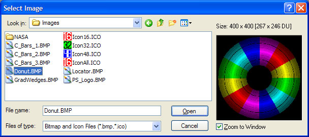
For dialogs and image controls, the ellipsis button brings up a Select Image file selection dialog. For dialogs, an icon may be selected, and this becomes the dialog icon. For image controls, the file selection dialog is used to specify the image assigned to the control, which may be either an icon or a bitmap file. The Select Image dialog includes a preview window to assist the selection of an image.
Once a dialog icon has been selected, the icon is displayed to the right of the ellipsis button on the Dialog Properties dialog. To delete the icon, click on this icon image, and PowerBASIC Forms will prompt to delete the icon. |
|
Class |
The Class field is read-only except when examining the properties of a custom-control. In this case, you may directly assign the window class name to this field. For example, "PBURL_CLASS". This class name is automatically inserted into the CONTROL ADD "custom-control" statement in the generated code. However, PowerBASIC Forms will not attempt to verify that the class name belongs to a real (registered) class, hence a dialog can be designed to use a particular custom-control even if it is not installed. |
|
ID Name |
The ID Name is a user-definable equate name that is used in the generated code to refer to the control. The equate must follow normal PowerBASIC equate (and variable) naming conventions. Existing ID Names can be reused simply by selecting the name from the drop-down list portion of the ID Name box. Note that this facility is primarily designed for sharing of ID Names across disparate dialogs and associated menu items. Using one ID Name for two or more controls on the same dialog is not recommended unless the controls will not be requiring any run-time changes. This restriction includes simple operations such as altering the caption, etc. |
|
arrow |
The arrow button next to the ID Name control provides access to a sub-menu containing the Use Caption in ID Name button. This button instructs PowerBASIC Forms to create an ID Name based on the Caption text and the prefix associated with the control or dialog. For example, if the caption is "Customer Name", and the default prefix for the control is %IDC, then the ID Name will become %IDC_CUSTOMERNAME. |
|
ID Value |
The ID Value is the numeric value assigned to the equate in the ID Name field, in the range 1 through 65535. PowerBASIC Forms generates the value automatically, but it may be manually edited. In the image above, the equate %IDC_FRAME1 is assigned the value 1001 in the generated DDT code. If you delete the ID Name for a control, the ID Value of -1 is automatically assigned. This should only be used for static controls (ie, LABEL controls) that are not going to be manipulated at run-time; otherwise an ID Name is required to reference the control. |
|
Tab Order |
The Tab Order is the sequence that controls are placed within the dialog construction code when the project is saved to a disk file. If controls specify the %WS_TABSTOP style, then the Tab Order determines the tab stop order (z-order). Tab Order also determines the order in which Windows draws the controls on the dialog when the program is running. When changing a Tab Order value, other Tab Order values are automatically adjusted so that the Tab Order values of all controls in the work dialog remain sequential and unique. For example, if there are three controls and the Tab Order of number 1 is changed to 10, then PowerBASIC Forms automatically changes the Tab Order of 2 down to 1, 3 down to 2, and then reorders 10 down to 3. Editing the tab order of controls can be achieved more efficiently with the Tab Order Editor. |
|
Font Name and Font Size |
The Font settings are adjusted through the FONT button on the Properties dialog, which brings up a standard font-selection dialog. If the default font is not used, PowerBASIC Forms automatically generates code to create the font chosen and embeds it all directly into the resulting DDT code. If font attributes such as bold, italic, underline, and strikeout are selected in the font-selection dialog box, the attribute names appear next to the font size in the Properties dialog box. |
|
Colors |
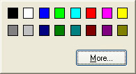
The Color selectors allow the selection of custom foreground and background colors, or use the (default) system colors. When the Use System Colors options are deselected, the respective arrow control becomes enabled. If pressed, PowerBASIC Forms presents a color selection dialog, offering the choice of 16 "standard" solid colors for the control.
The color selection dialog can be dismissed by clicking on any other window. The MORE button brings up the standard Windows color selection dialog, which gives the ability to create custom colors. Note that using colors outside of the default set of 16 can cause the colors to appear dithered when the project is run on systems with 256 colors or less. The Colors selectors are disabled for controls that do not support generic color change methods. For a list of lists of controls that support foreground color change, background color change, and a transparent background (attribute of -2) see the Control Color topic. |
See Also